Compass Design System
78% Reduction in Complexity, 4x Faster Iteration, and Streamlined Design-Engineering Handoff
Project Overview
As a product design contractor at a growing SaaS company, I inherited an outdated, overly complex Figma library that lacked scalability, structure, and alignment with the codebase. There was no governance model, no design tokens, and almost no usable documentation. Despite multiple designers contributing, the system was fragile, inconsistently used, and ultimately slowed product delivery. I led the initiative to transform the design system into a scalable, token-driven, and documented source of truth, establishing shared ownership between design and engineering, introducing Atomic Design principles, and implementing governance processes that brought consistency and efficiency to product development.
Overview of Role and Responsibilities
Transformed an outdated Figma library into a scalable, token-driven design system, establishing governance and documentation while fostering collaboration between design and engineering for consistency and efficiency.
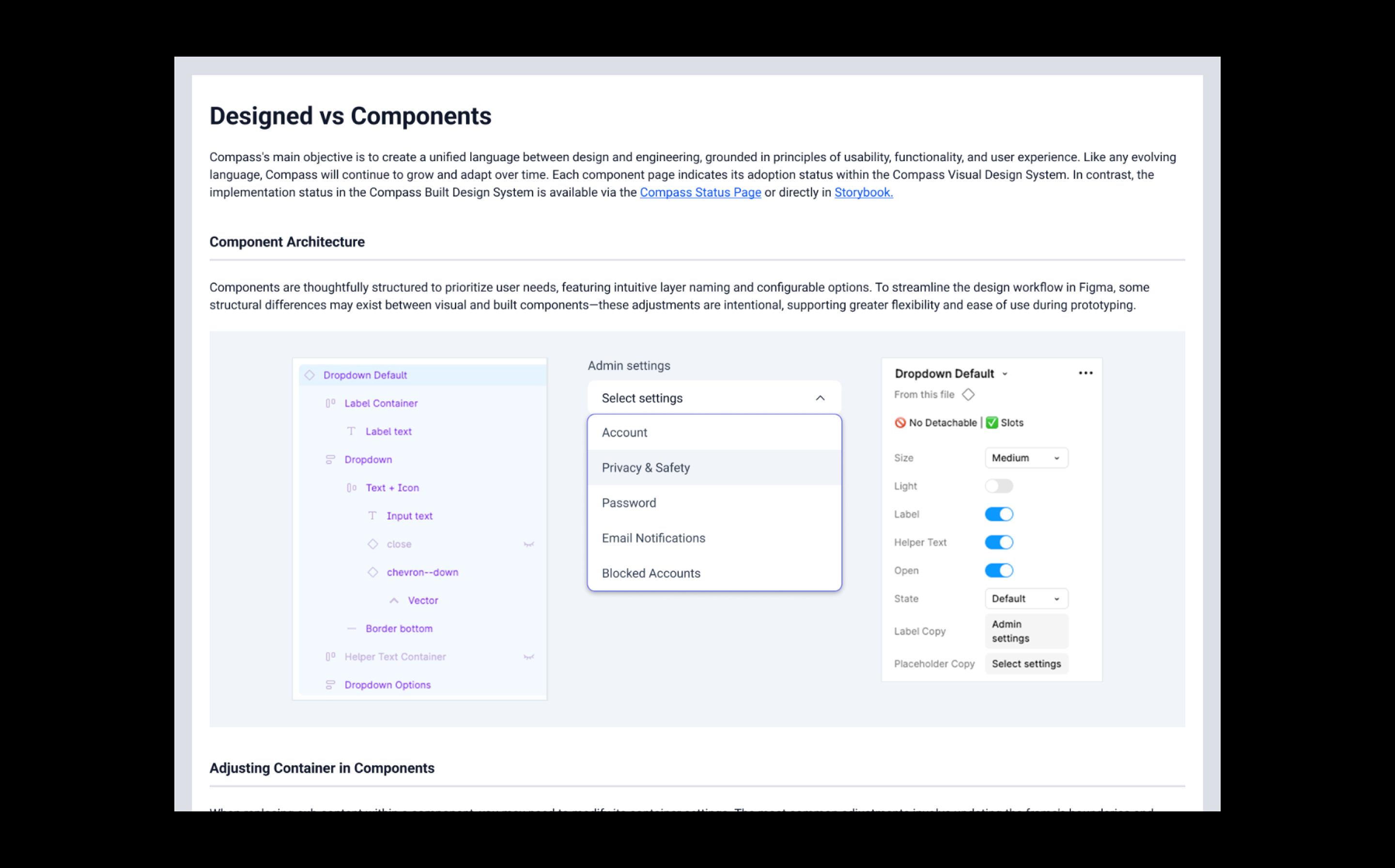
The Challenge
The design system had over 100 undocumented and fragile components, lacked design tokens and cascading logic, and was misaligned with engineering, causing instability, inconsistency, and confusion as more designers contributed without clear standards or naming conventions.
Project Scope
Led the end-to-end redesign and governance of a scalable design system using Atomic Design methodology, auditing components, establishing workflows and documentation, and aligning Figma with front-end architecture to enable cross-functional collaboration and a coded component library.
Solution
Comprehensive Audit and In-depth Analysis
Categorized components by usage and repair priority; collaborated with engineering on high-impact fixes; identified structural issues like lack of reuse logic and complex properties.
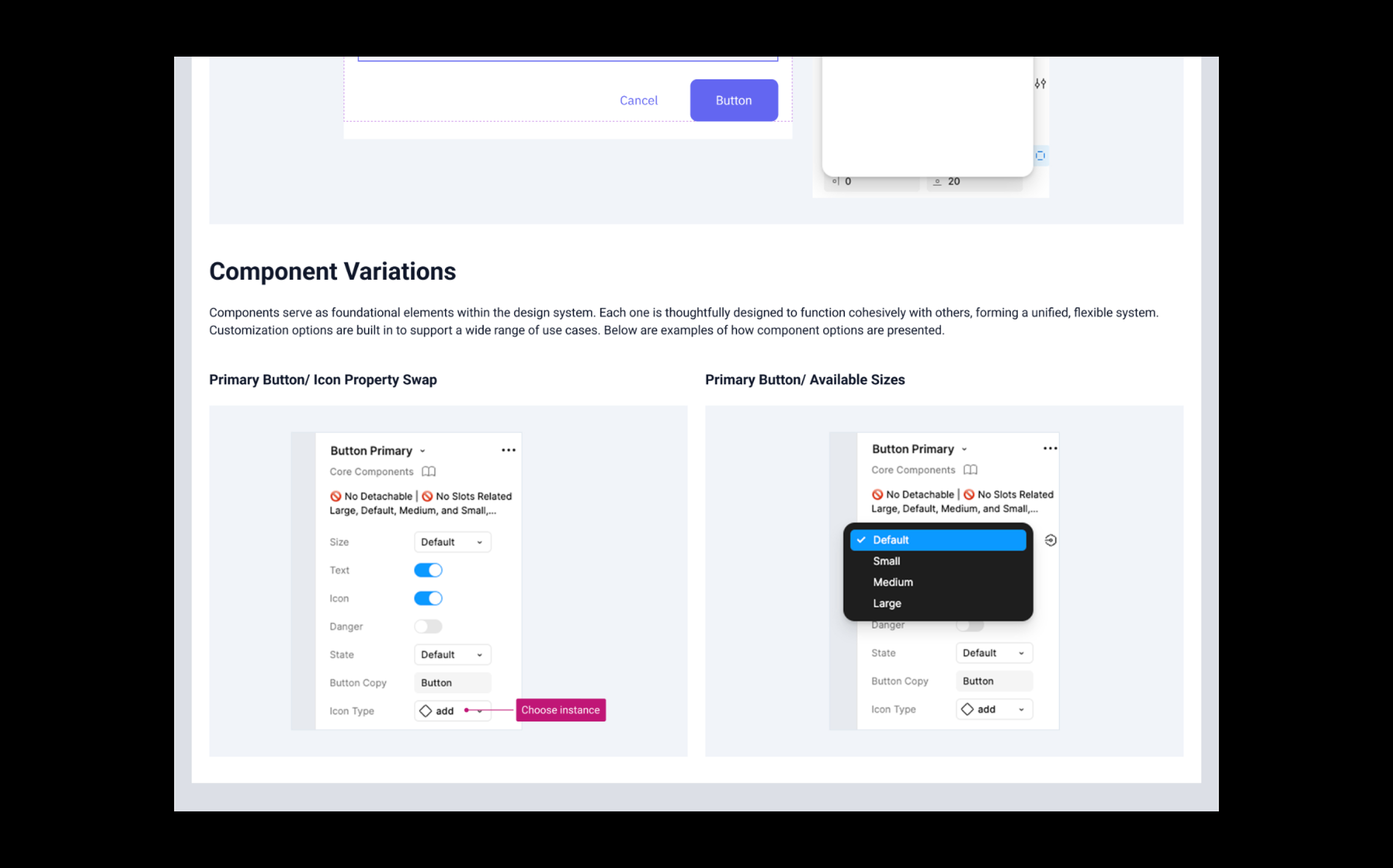
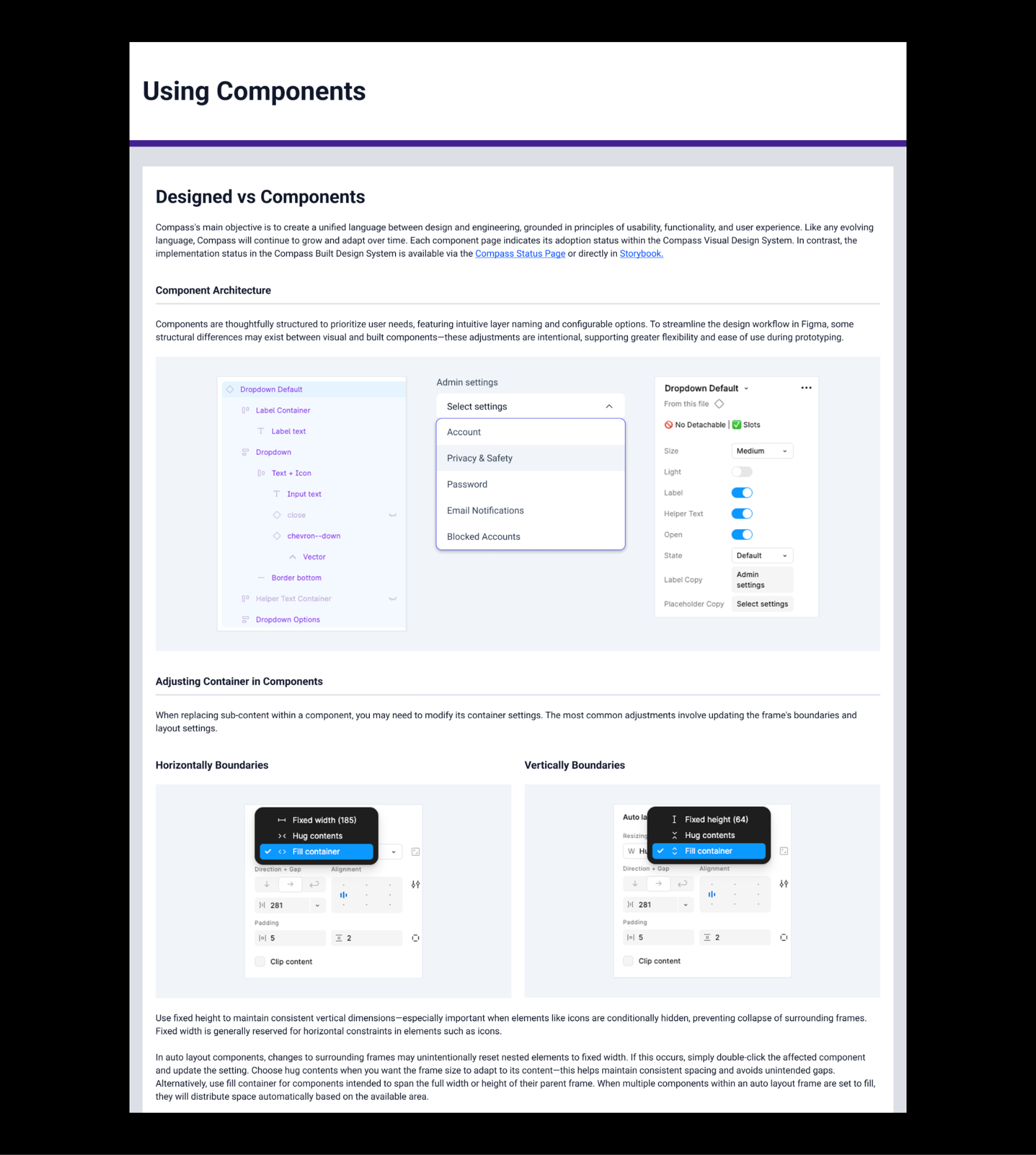
Applied Atomic Design for Scalable Architecture
Reorganized the system into five hierarchical levels: sub-atoms, atoms, molecules, organisms, and templates. Introduced slot components to enhance flexibility while maintaining consistency.
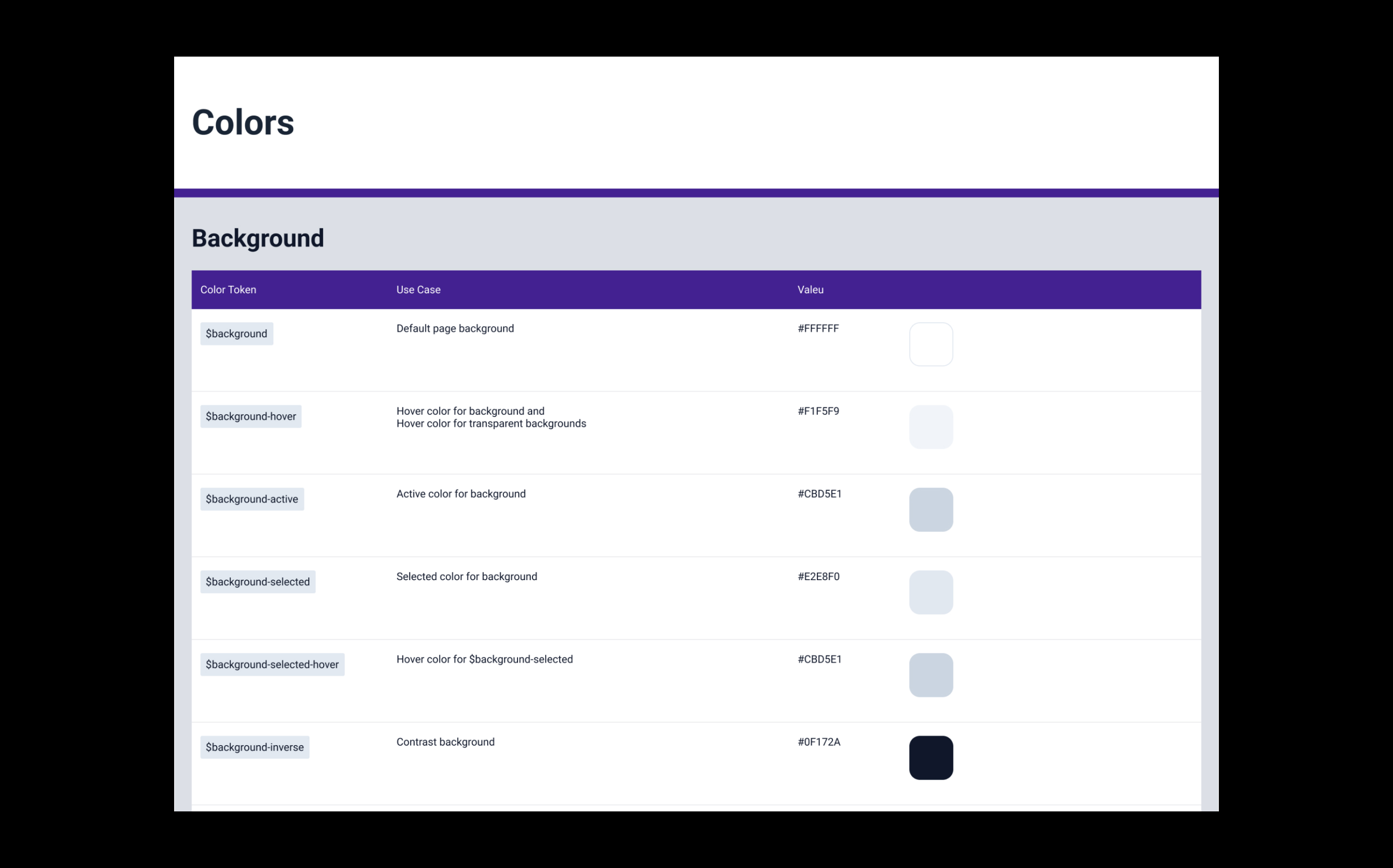
Token-Driven Consistency
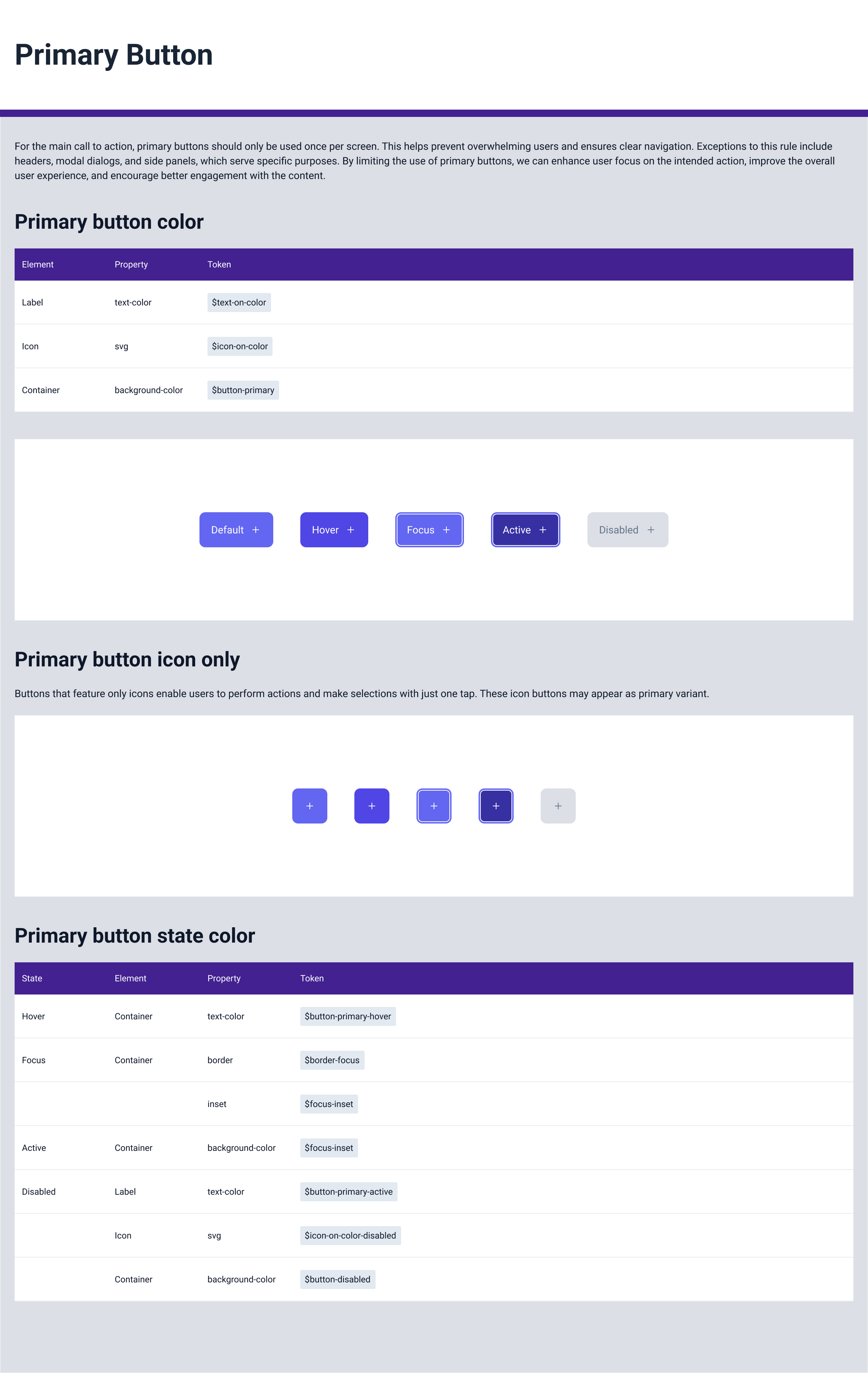
Implemented a robust token system for color, spacing, and typography that dramatically reduced component complexity by 78%, while strengthening design flexibility and enhancing system resilience.
Documentation & System of Record
Centralized documentation will use Figma as the primary source, along with an internal Wiki for component usage guidelines. Each component will include use cases, part types, common pitfalls, and recommended workarounds.
Reflection
This project reinforced that a design system is not a file, it's an ecosystem. The real value comes not from perfectly built components, but from shared standards, intentional structure, and consistent collaboration.
Next Project
T-Mobile Prepaid