T-Mobile Prepaid
Reduced checkout abandonment by 23%, cut support tickets by 50%, and boosted self-service completion 20%, enhancing customer trust.

Project Overview
As the company scaled, a surge of new users revealed a critical failure point in our digital purchase experience. The checkout flow, previously functional at smaller volumes, was now leading to crashes, drop-offs, and mounting customer complaints. Stakeholders were misaligned on whether the core issue was infrastructure, interface usability, or miscommunication of value. There was no clear direction, but we knew loyalty was dropping and revenue risk was rising.
Overview of Role and Responsibilities
As Lead UX Designer, I led the user experience strategy for the revamp, conducting UX research, aligning stakeholders on actual issues, and driving the redesign from insight to implementation.
The Challenge
The existing purchase experience was breaking under growth. Users faced unclear steps, confusing plan language, and unexpected errors. Heuristic audits surfaced 20+ violations. Worse, users often abandoned mid-flow due to mistrust and lack of clarity.
Our biggest obstacle?
No one agreed on the problem. Engineering blamed traffic spikes. Marketing thought the plans were too complicated. My role was to clarify, unify, and lead.
Project Scope
Identified key pain points through both qualitative and quantitative research, which included interviews and usability tests. I conducted an audit of the user journey to uncover UX debt and bottlenecks. Then, I collaborated with product managers, engineers, and support teams to identify core customer issues. Based on feedback, I developed and refined prototypes, emphasizing the importance of trust and transparency features, such as plan comparisons. Finally, I aligned stakeholders on a phased launch strategy for the minimum viable product (MVP), focusing on both impact and feasibility.
Solution
We didn’t just “make it prettier”, we reimagined the purchase journey with clarity, trust, and control as our guiding pillars.
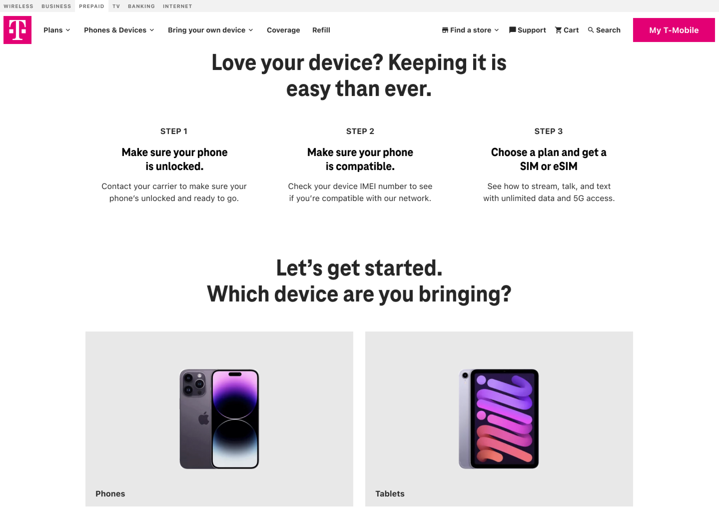
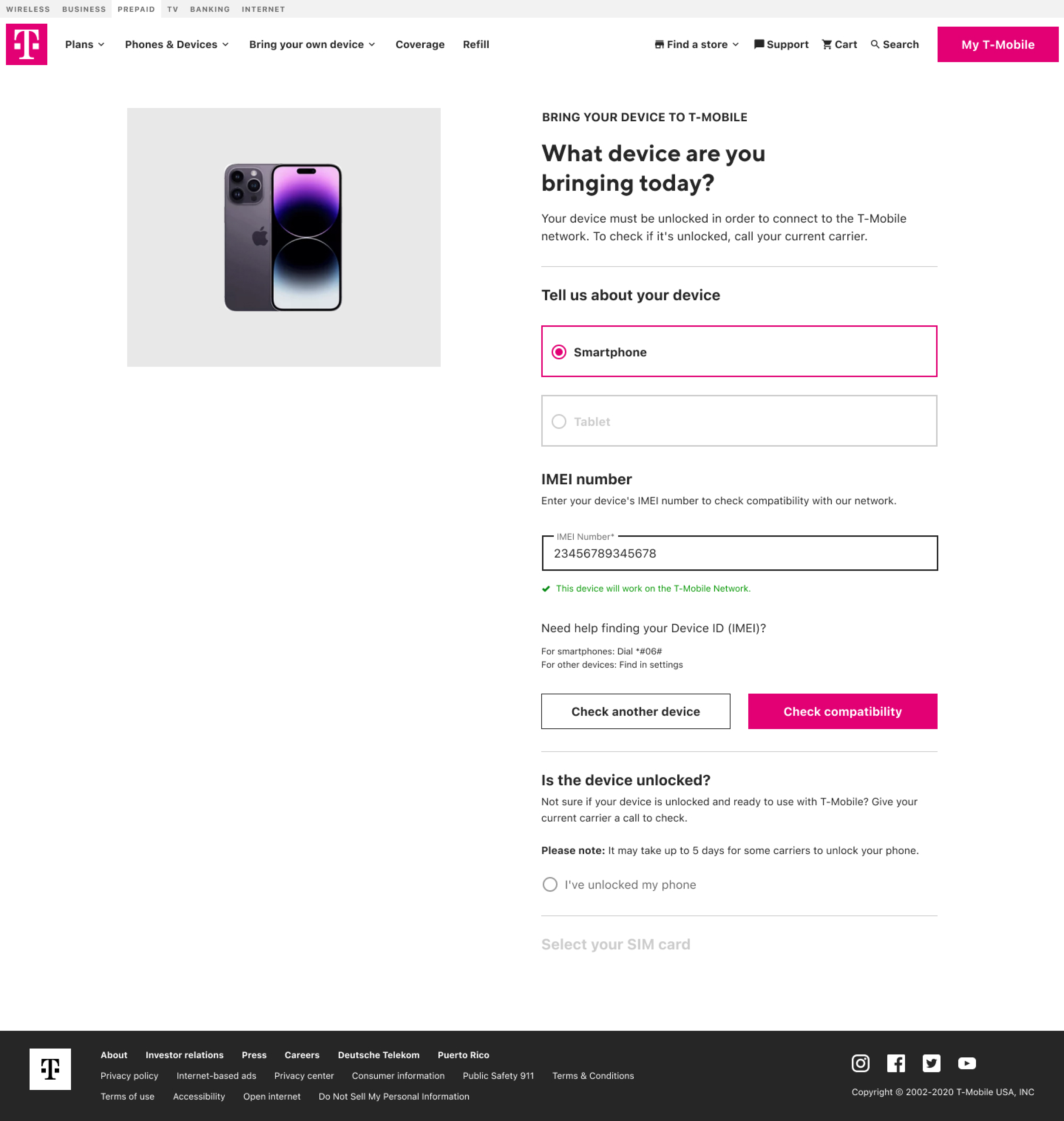
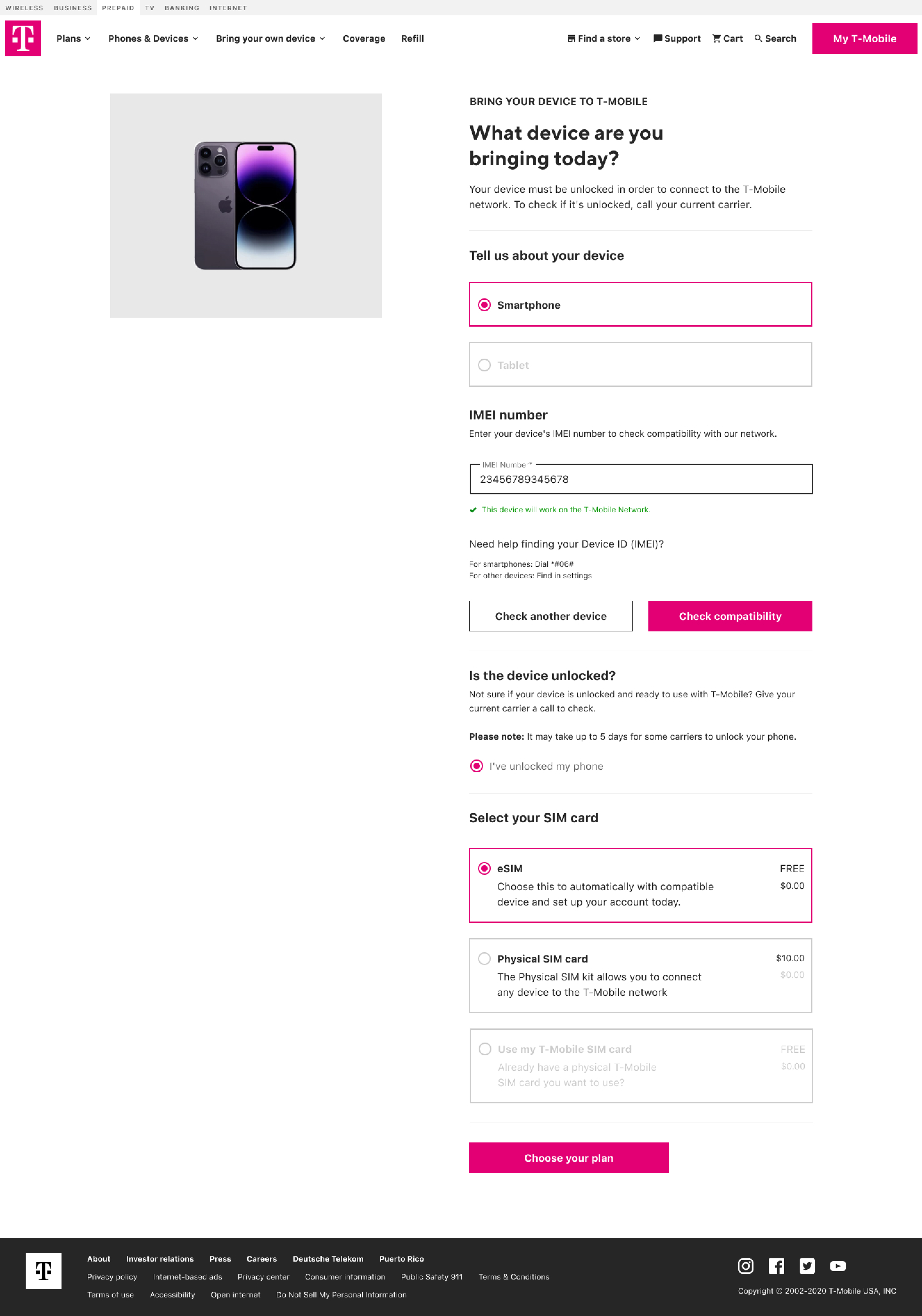
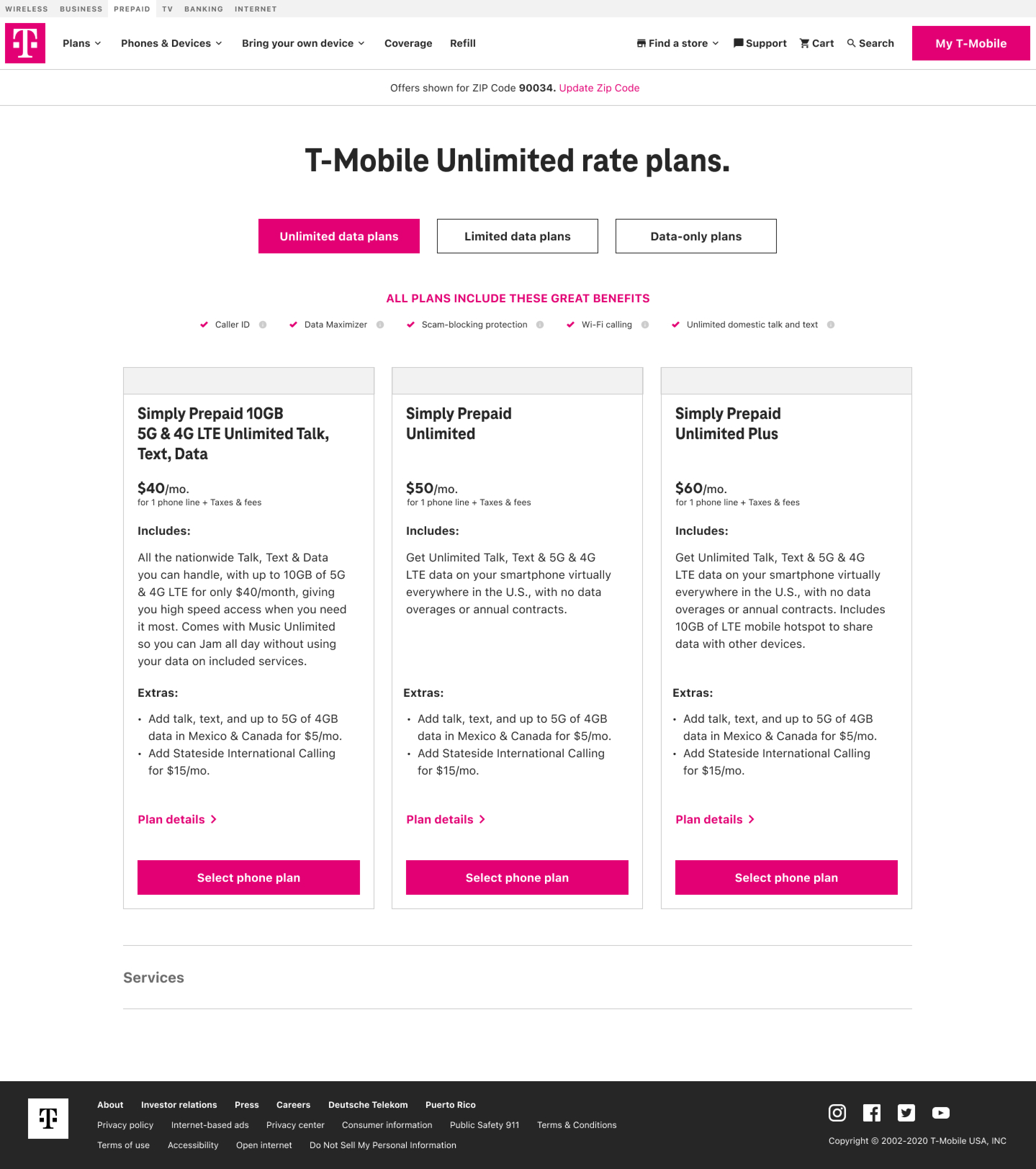
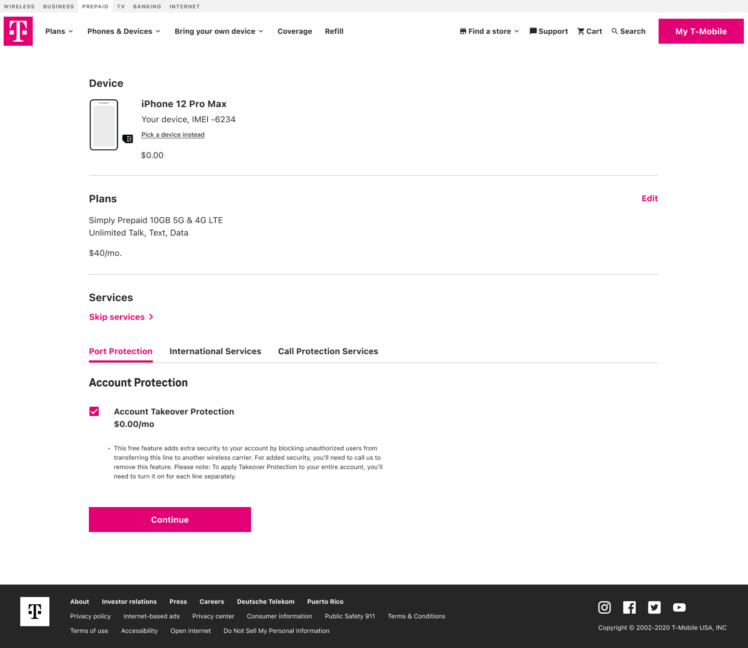
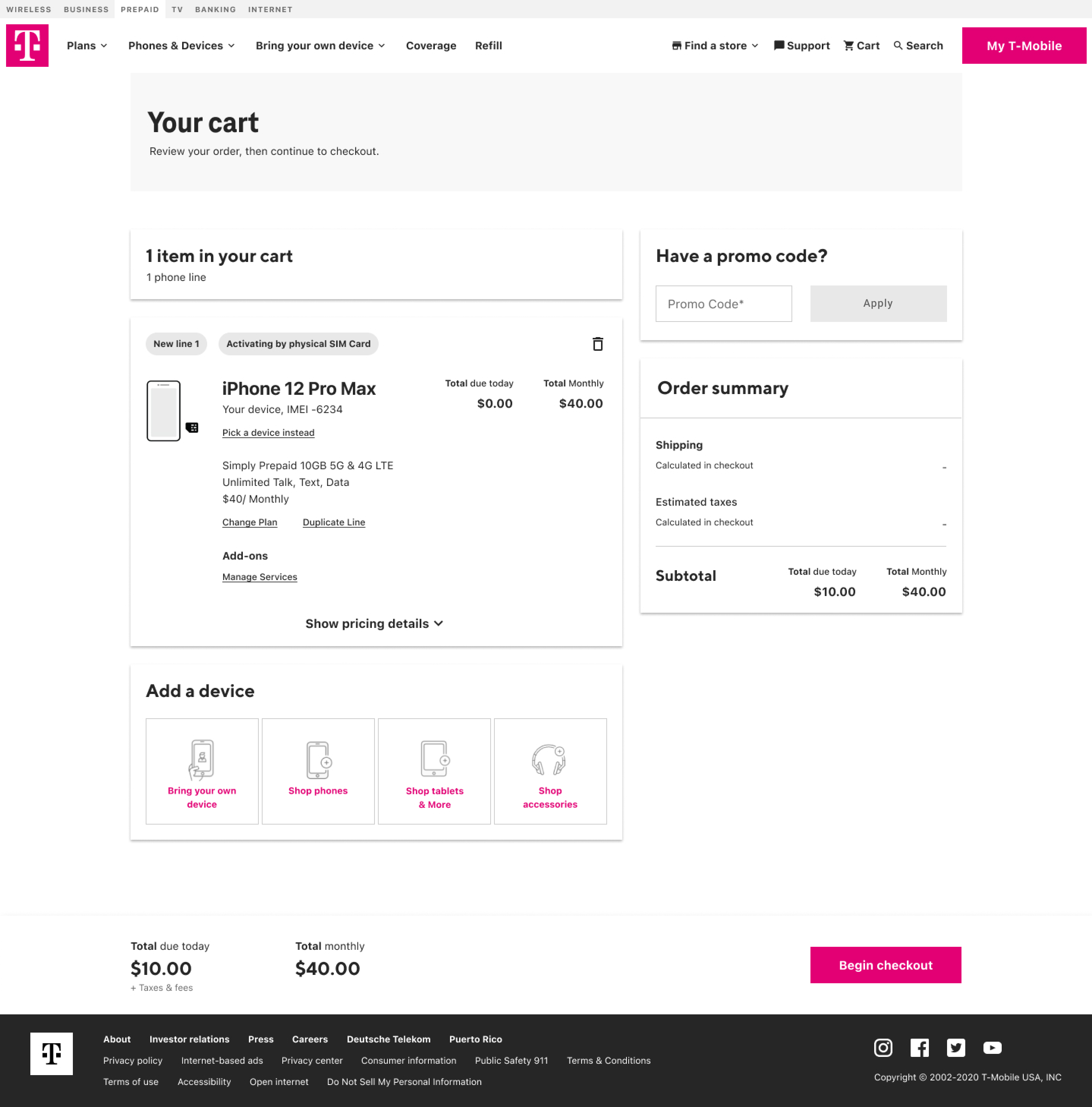
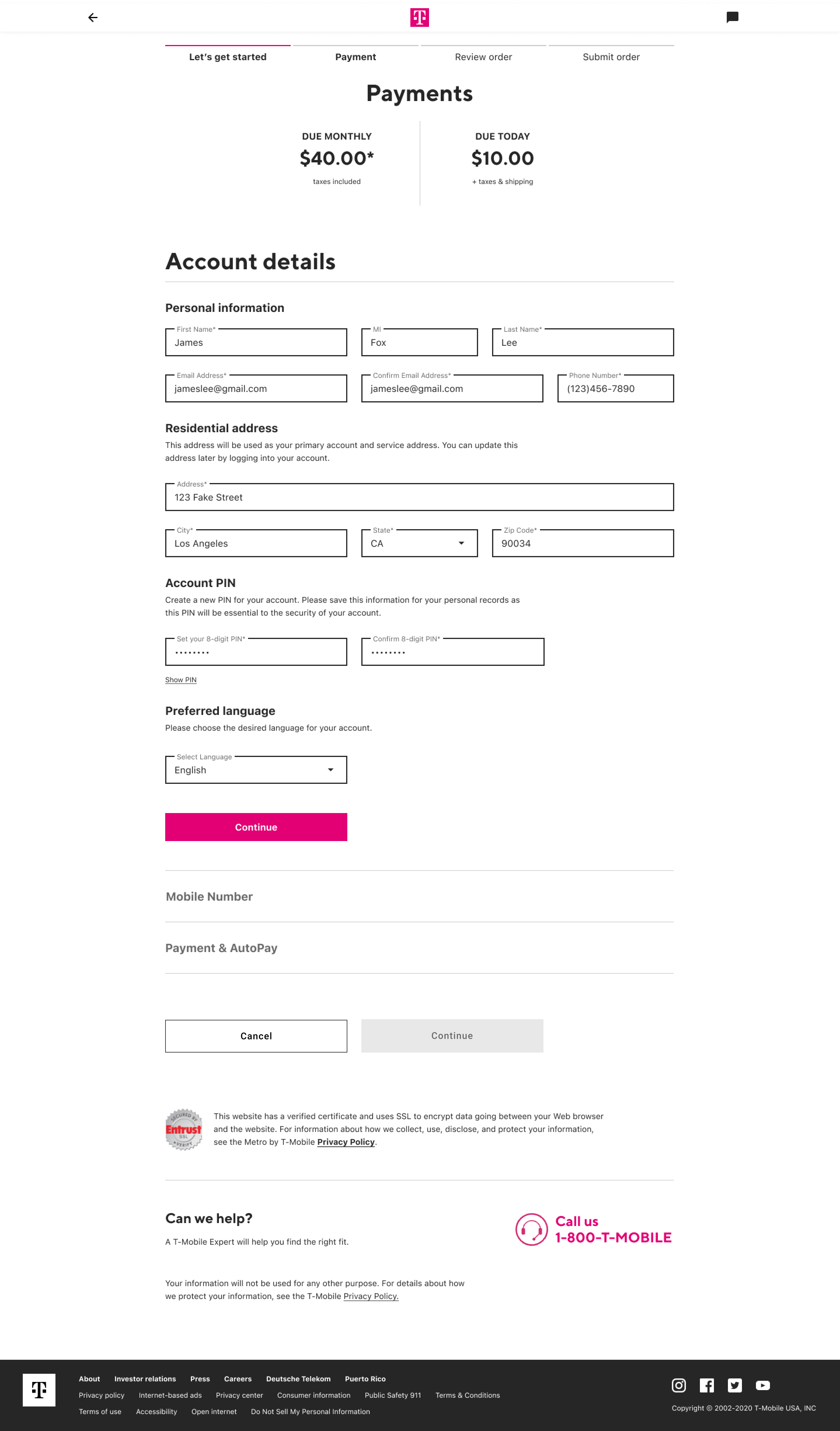
Enhancing Purchases: Device Validation, Real-Time Plan Comparison, and Streamlined Checkout
Implemented device verification and real-time plan comparisons to enhance purchasing decisions. Optimized processes for various customer profiles to improve responsiveness and reduce checkout friction.
Iterative Design: Tailoring Prototypes for Three Customer Segments
We created and evaluated prototypes for three distinct customer segments, making weekly adjustments based on valuable feedback to enhance our designs and cater to the specific requirements of each group.
Reflection
This project emphasized the need for clarity in ambiguity. I realized that a senior designer's role extends beyond delivering features to influencing product direction, aligning teams under pressure, and advocating for users.
Next Project
Compass Design System